Latoyah Forsyth has been with the Melbourne Recital Centre (MRC) for 12 years and, for all
of that time, she’s been itching to give its image a complete overhaul and expand the
perceptions of it as a specialised venue, of interest only to a particular cohort of visitors.
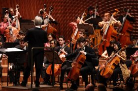
One of Melbourne’s most perfectly realised spaces for appreciating live music, MRC was
originally purpose-built for the performance of classical and chamber music. It opened in
2009, but hardly two years had passed before the venue was already diversifying its
program. As jazz, folk, blues, indie and electronica music were added to the mix, the identity
of MRC evolved and shifted.
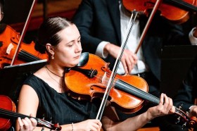
“We’ve always had that beautiful core base of classical music lovers and classical
connoisseurs, but we’ve also been able to connect with so many different types of music
lovers as we’ve expanded our program, but our brand and website hasn’t necessarily come
along with us on that journey,” explains Forsyth.
Having moved into the role of Director of Engagement and experience, Forsyth finally got
her chance to address MRC’s image during COVID. “There’s nothing like a pandemic to fuel
transformation,” she laughs. “I do believe it was a combination of right time, right place for
everyone involved.”
The timing was also influenced by MRC’s location. Sandwiched between the Melbourne
Theatre Company’s flagship theatre, The Sumner, and the ABC studios on the other side of
Sturt Street, it will mark the southern gateway of the Melbourne Arts Precinct
transformation project, due to open in 2028.
“So we need to make sure that we are standing there, really proudly and knowing exactly
who we are and what we do, so that we can maintain our voice in the precinct that will be
all shiny and new and exciting,” says Forsyth.
Addressing the brand redevelopment, she was adamant that it needed to be a holistic
offering. “Brand isn’t just a logo. It should never just be a logo. It needs to be a full
comprehensive experience that can traverse all different types of platforms and situations,”
she says.
But this had to happen in a financially responsible way. “We’re a government organisation,
and so we’re often held to far stricter account with monetary expenditure, particularly when
it comes to marketing,” notes Forsyth. “And so that level of fiduciary responsibility is very
front of mind for me. We had to make the most of what we could. And MASS really came to
the party with that…”
Finding the honey
Enter Tim Kotsiakos, Creative Director and Founder of Studio MASS. While MASS initially
tendered for MRC’s new website design (eventually created by Studio Bravo), Forsyth saw
the studio as a natural fit for the brand redevelopment. There was immediate synergy, she
says. “Tim brought his iPad, and said, ‘I hope you don’t mind, but I have shortlisted some
global examples that I think Melbourne Recital Centre could use as inspiration for what a
brand redevelopment approach could and should look like…’ and the first three examples
were the first three that I had shortlisted with my team!” recalls Forsyth. “My team laughed
because my eyes completely bugged!”
The top one was the new brand for the San Francisco Symphony. “What we both equally
loved … was that it utilised music in a way that has not been seen in an arts or music brand,
and it was able to, within a consistent brand architecture, create moments for it to flex and
stretch, quite literally, to create moments of uniqueness depending on the type of concert
that it was, or the type of experience that it was.
“It was a real holistic approach that spanned not just visual but the audio brand as well,” she
adds.
Kotsiakos was able to take this idea and run with it. But first MASS needed to know exactly
what the challenges were. A survey of around 17,000 people provided some useful data, but
so did a simple response from a friend. “I said ‘I’m going to the Melbourne Recital Centre’,
and his response was ‘that’s a bit fancy, isn’t it?’” says Kotsiakos.
“So that’s the exact person that we wanted to basically challenge and dare to actually go
there – to create this brand in a more contemporary, relevant visual language that appeals
to a broader range of people.”
Another absolutely key finding was that, even if people hadn’t been to MRC or had the
preconception that perhaps it was “a little bit stuffy”, the building itself was perhaps an
excellent brand asset.
“You would say, ‘Do you know the Melbourne Recital Centre? And they’d look at you
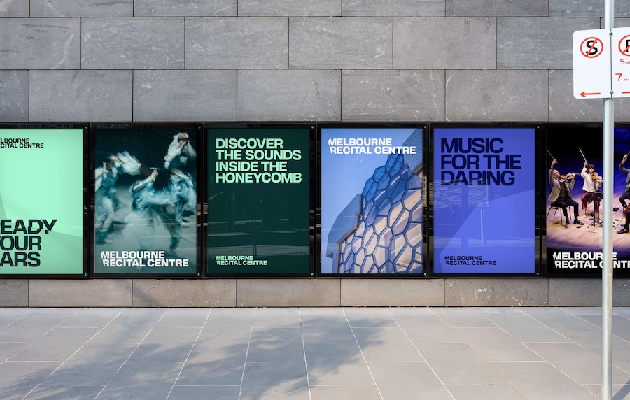
blankly. Then you’d say ‘it’s the building with the honeycomb shaped windows up front. And
they’d go, ‘Oh, I get it! I know that one!’
“Hence, we really lent on that honeycomb shape in a lot of our visual language of the
brand,” he explains.
As it is such a contemporary looking venue, it was a seamless route to associate the
honeycomb image with being daring and trying new things – immediately fulfilling the
request from MRC. “Their brief was broadly ‘be bold’,” says Kotsiakos.
This strategic position helps MRC twofold. It appeals to its existing audiences by
complimenting their traditional willingness to investigate “music that isn’t always that
popular – it’s a tip of the hat to the composers that we all know and love, who are
essentially pioneering, daring people in their own right,” explains Kotsiakos. “But it was also
an invitation to this new audience to just try something. Put aside your reservations about
whether you have to look a particular way and what recital music is, and just give it a
chance.”
Year-round programming
The honeycomb-inspired branding also answered the challenge of presenting an
organisation that needs to talk about both itself and the various and varied events that take
place within its acoustically magnificent spaces. “Sometimes they’re promoting MRC as a
location. But the other 85% of the time they’re actually promoting performances,” says
Kotsiakos. This entailed “creating a really extensive brand language… with lots of variety in
terms of how shapes and type and everything can be used,” he adds.
Then there is the colour system, which ensures that on a wall with 20 different posters of
artists, the typography used, the saturation of the colours and, above all, that hexagonal
honeycomb shape, “ties them all together visually”, says Kotsiakos.
It’s early days with the rebrand launching only last month, but Forsyth says the initial
responses have been very positive. And the aspirations to connect with a wider public have
been addressed.
“For us, we really focused on folks being able to see Melbourne Recital Centre as that place
to make them feel better, their lives feel better, and go on that discovery journey. And so
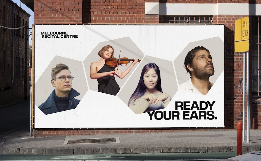
that’s our value proposition: there’s music for the daring and a whole suite of call to actions
about ‘dare to escape’, ‘dare to feel different’, ‘dare to do something just for you’,” she
concludes.
For more on the Melbourne Recital Centre’s programming and new image.