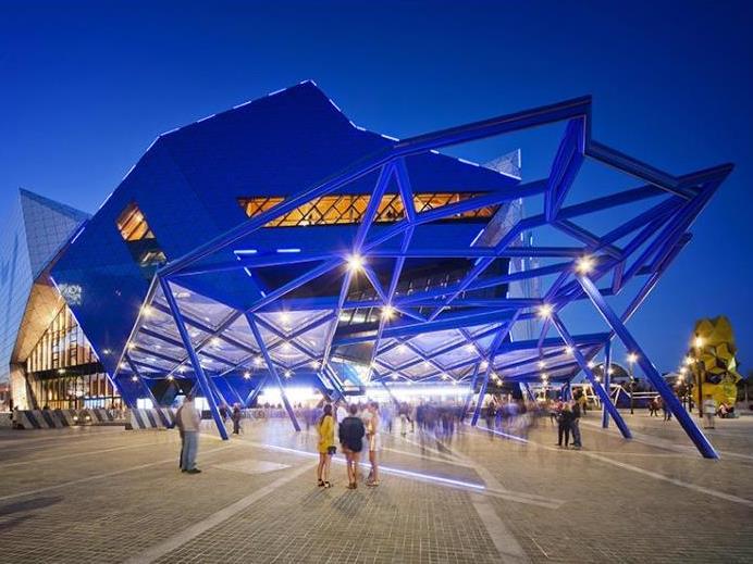
Perth Arena Photo:Greg Hocking
1. The Arena has landed
The winner of the Australian Institute of Architects Public Architecture Award for 2013 was the Perth Arena, a joint project designed by ARM Architecture and Cameron Chisholm Nicol. The Jury described it as ‘a radical, abstract, graphic alien that has landed on the edge of the CBD’. The music and sporting venue can be transformed in size to suit various crowds for a great variety of events with enormous curtains to reduce or enlarge the space, ensuring the vibrancy of a full house every night.
‘The Perth Arena solves some very complicated conflicting requirements with deft, simple moves – these clear solutions similarly can only be found after obsessive testing and retesting of proposals. Feats it has pulled off include the fact that it is an intellectual building that manages to be popular; it is a type that is often urbanistically hostile, but here makes an urban contribution; it is robust in detail suited to sport and popular music, but gives a finely crafted spatial experience to the huge crowds. This is puzzle solving at the highest level,’ the jury said.
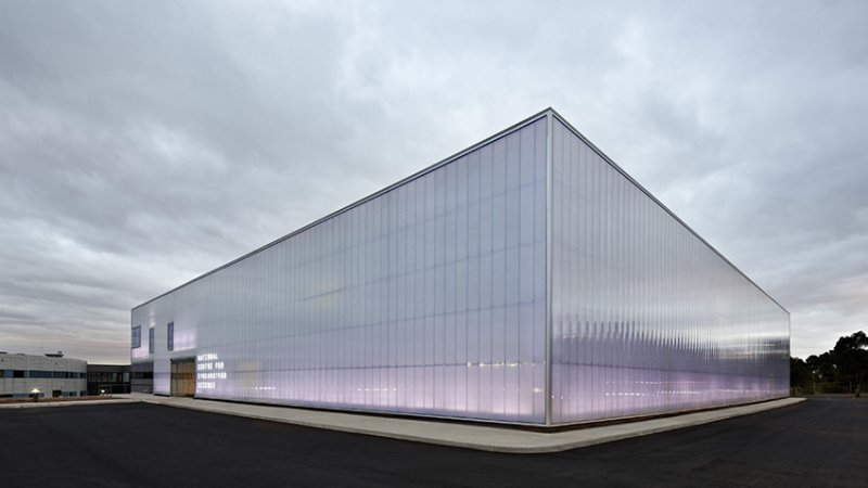
The National Centre for Synchrotron Science Photo: Peter Bennetts
2. Making Light Visible
This one is something an architect will only get to design once. The National Centre for Synchrotron Science in Melbourne was designed by Bates Smart. It houses Australia’s only synchrotron, a machine about the size of a football field that accelerates electrons to almost the speed of light, providing experimental conditions for a range of research. Bates Smart says the building takes its cue from the Australian Synchrotron’s international role as a sophisticated, high technology research facility using light as a medium. Translucent, acrylic panels, infuse the gallery space with a polychromatic ethereal light. Plastic lenses inserted into skylights are positioned around the perimeter of the theatre, pushing natural light down and through the wall cavity to form a stunningly radiant built presence of high brilliance. The resulting shimmering quality makes the constant movements of light visible.
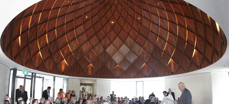
Meeting Room, St. Mary’s Cathedral Centre Photo: Peter Whyte.
3. Domed drama
Domes have been used by churches – as well as mosques and politically important buildings – from the Hagia Sophia in Istanbul to St Peter’s Basilica in Rome. Circa Morris-Nunn Architects brought the drama of the dome to their design for the Meeting Room at St. Mary’s Cathedral Centre in Hobart with a modern twist, lining the striking concave ceiling with timber. The room, which took out the Tasmania architecture award for interiors, was a relatively modest project at just $2 million. It is the first stage of a major renovation for the aqgeing cathedral, which opened in 1886.

Hamer Hall Photo: ARM
4. The Sight of Music
After two years and $135.8 million, the Concert Hall of the Victorian Arts Centre re-opened in April to showcase a massive renovation for the 30-year-old building. Architects Ashton Raggatt McDougal provided improved acoustics and very comfortable seating for the renovated hall, as well as a new terrace which allows the building to open onto the river. The architects described the terrace as as a counterpoint to original architect Roy Grounds’ ‘archaic geometry’. ‘Its form was generated from our interest in dynamic and open‐ended spatial systems, made by carving, aligned with the original architectural concept of excavation.’
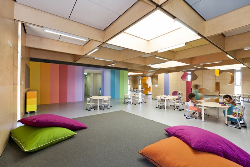
John Septimus Roe Anglican Community School Kindergarten Photo: Heather Robbins.
5. Child’s Play
Some lucky kids will be doing their finger-painting inside the Australian Interior Design Public Award winner. We hope they are still allowed to make a mess. The kindergarten room from the Beechboro Campus of the
John Septimus Roe Anglican Community School was designed by Brooking Design Architects to be anything but institutional. Large jigsaw pieces are used as cabinets and room dividers in the Nordic-style room which features bright colours and huge skylights.
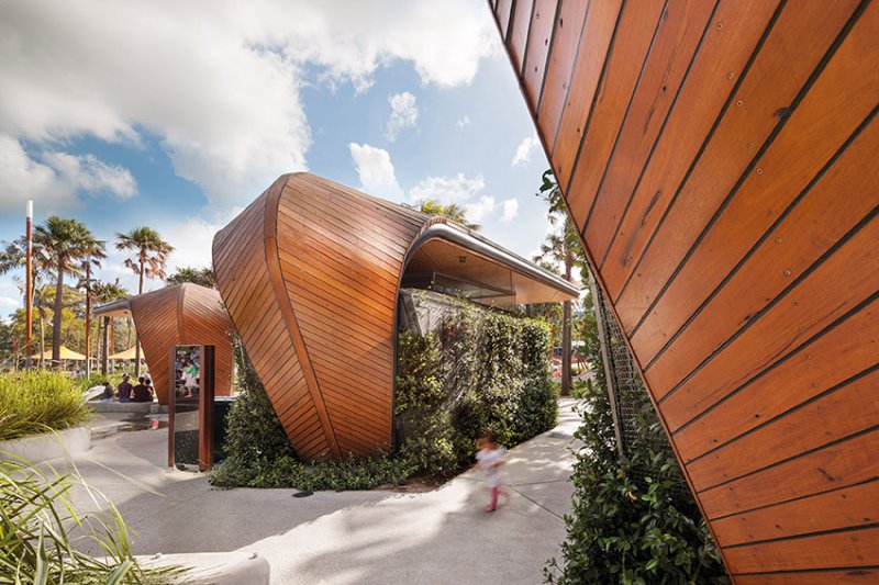
Darling Quarter Photo: John Gollings
6. Planted walls
Sydney’s Darling Harbour got a green extension with this 64,000sqm Darling Quarter project encompassing commercial and retail functions, a children’s theatre and integrated public domain. The concept, created my Francis-John Morehen Thorp (fjmt) was strong on sustainable architecture and achieved a 6 star green rating for features including these plant covered and shapely boat-like structures.
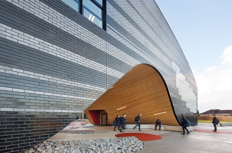
PEGS Senior School, Photo: John Gollings
7. To infinity and beyond
The students of Penleigh and Essendon Grammar in suburban Melbourne have caught a wave with their new senior school building, designed by McBride Charles Ryan. The building is based on an infinity symbol with classrooms around the edges, a library at the centre and two courtyards within the voids. The architects responded to the symbolic power of the library by ensuring all routes led back to the central resource and dealt with the windswept open site by providing courtyards protected by the building’s walls. Different colours are used for different academic disciplines but the areas are seamlessly connected to the next. ‘In this way the building acts as an embodiment of the journey of education, with less distinction of any prescribed boundaries between disciplines,’ the architects said.

Australia House, Japan Photo: Brett Boardman

Australia House in the snow
8. Australia Abroad
Australia House is a gallery and studio about three hours north of Tokyo. After the previous building collapsed, as a result of an aftershock from the 2011 earthquake, architect Andrew Burns won an international competition to design a new building ‘as a symbol of healing and transformation’. Burns’ triangular design was a response to the heavy snowfall in the region, giving the building a powerful impact both when exposed in summer and when only the roof is visible under heavy snow. Burns wanted to create a building that showcased both the surrounding landscape and the art exhibited there. ‘The building alternates between a familiar domestic presence and that of an art object. The interiors form a large ‘perception device’, heightening views of the surrounding landscape and creating opportunities for art installation,’ he said.
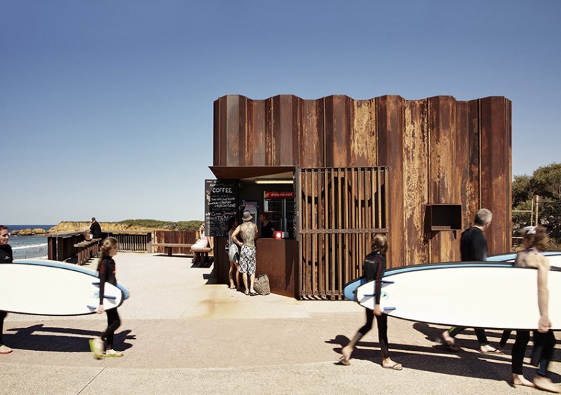
Third Wave Kiosk, Photo: Rory Gardiner
9. Ice cream with style
Beautiful doesn’t have to be big. Tony Hobba Architects designed a beach kiosk in Torquay, on the Great Ocean Road that won a National Commendation by the Australian Institute of Architects, in the category of Small Project Architecture. Using rusted flood fortifications, Hobba created a building designed to feel raw and open to the forces of nature. ‘This project was inspired by the eroding forces of the ocean. The skin of rusting steel piles driven into the dunes provides a canvas for the expression of these natural forces. The oxiding patina nestles into the coastal scape, suggesting a piece of washed up furniture, maybe cobbled together with found materials,’ he said.
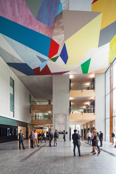
Queen Elizabeth II Courts of Law, Photo: John Gollings.
10. Colour in court
