An enduring contradiction of the Australian mentalité is why such a heavily urbanised and suburbanised population continues to place a special value and significance on the landscape, be it the bush, sea and shore, the coastal littoral or the outback. One of the most interesting themes in painting post 1970 has been a renewed emphasis on city and suburb in its iconography. The city as object and environment, as much as the land, shapes identity. There is a growing conviction that urban images are more representative of the Australian experience.
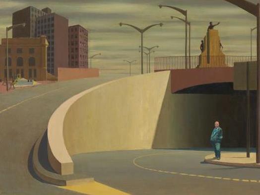
The emergence of Jeffrey Smart as a major figure in modern Australian art is a measure of this new direction, as he shed his neo-romanticism for a more incisive style. The change started in 1962, with his much reproduced and rightly celebrated Cahill Expressway. The irony of this work persists. Smart chose one of the most banal, ugly and awkward parts of Sydney (his adopted home until 1963), a city that he freely admired as one of the most beautiful in the world. Emptied of the traffic that pours through the tunnel and up the hill, night and day, the shadowy entrance of the expressway now suggests, lightly, a gateway to the underworld. The heroic gesture made by the sculpture—an invention of Smart’s—above the entrance warns and invites the unwary. In a further irony, Smart places the sculpture directly over the portly figure of the bald man in a blue, bourgeois suit. Smart’s feel for the geometry of the city, where curving forms uneasily meet sliced and slanting ones, here finds one of its earliest and finest expressions. It was to become his trademark. Smart’s irony and geometry should deflect and deflate any facile reading of the painting as an essay in urban estrangement. The environment may be unlovely and inhospitable, but the lone figure looks unabashedly at the viewer with a discernible grin. The final irony of Cahill Expressway is that Smart inverts the common trope of the figure in the landscape by placing a contemporary man against the city, immediately giving the painting a ring of authenticity.
From 1963 on, Smart was effectively an expatriate artist. After a restless and nomadic 1960s he bought a farmhouse, Posticcia Nuova, outside Arezzo in Tuscany, and he lived and worked there for the rest of his life. Although he continued to show with the Redfern Gallery in London until 1982, he exhibited regularly in Melbourne and Sydney, and was to all intents and purposes as much part of the Australian scene as his contemporaries. His subjects may have been drawn from Europe but his themes of the industrialised environment and implaca- ble urbanisation were universal. His steadily rising commercial and critical success occurred for many reasons: his meticulously realised paintings implied a narrative; a Pieroesque lucid- ity and rationality joined the ambiguity and mystery of his mise-en-scène; but, most of all, his vision of an industrialised, urban world resonated with the Australian experience post 1970. Smart almost invented the dual nature of the city as object and environment.

Jeffrey Smart, Corrugated Gioconda, Image: National Gallery of Victoria
Corrugated Gioconda (1976) uneasily presents both of these characteristics of the city. Human activity and presence is everywhere, apparent in the peeling poster, fragmentary signs and over-scaled fence. Pushed hard against the picture plane, the corrugated fence closes down the space. The environment is claustrophobic and the unsettling light source, plungingmuch of the foreground into darkness while the office or apartment buildings gleam in white emptiness, adds to the slightly sinister air of this fragment of the city. As always, irony is at play as Smart places the over-familiar image of the Gioconda into this aimless and airless building lot. The effect of the city is nearly always for Smart a deracinating experience. Human activity may abound, yet the world remains profoundly antagonistic to human needs. Smart’s special quality as an artist is to make such a foreboding vision so aesthetically exhilarating. Whether his existence as an expatriate nurtured these deeply estranging images is worth some speculation. Smart loved Italy but was forever drawn to the discordant urbanscape. Such scenes unconsciously displaced his sense of exile; forever making his art in a world nobody could identify with or belong to.
The image of Melbourne presented by Jan Senbergs differs sharply from Smart’s estranging city. Senbergs had drawn Port Melbourne from life in 1979 when he was living there on his own. These impressive port pastels grew into an impressive series, the Port Liardet paintings, named after the first publican of Port Melbourne, Wilbraham Liardet, and also an early limner of the suburb in drawings and watercolours. Senbergs conjured up a fantastic port of the imagination, which had, from time to time, uncanny snatches of the contemporary scene. But his experience in the United States, when he was Visiting Professor of Australian Studies at Harvard for the northern academic year 1989–90, was the turning point in making him a painter of the city. ‘By their cities shall they be known’ is a universal truth of the American experience and Senbergs responded avidly to Boston, Pittsburgh and Chicago, as well as New York and its environs—memorably painting the Pulaski Skyway across the badlands of New Jersey. He adopted the bird’s-eye perspective, as the early illustrators of American cities had done, presenting a hybrid of the urban view and a map.12
The 1999 work Melbourne, commissioned by the State Library of Victoria, is the familiar place: the city on display. Senbergs delights in picking off the local monuments, from the Melbourne Cricket Ground (MCG), that secular shrine, to the Arts Centre, the casino and the bridges of the Yarra from the Princes to the Westgate, just discernible as the painting pours over the giddy horizon. He brings such brio to his panoramic map. The rhythm of the painting lies in the sinuous curve of the Yarra River, which gives the city an organic quality—a hive of human activity. The painting celebrates the urban, takes pride in its landmarks and its com- mercial energy; the city is the quotidian reality of the Australian experience. Senbergs brings the sense of space and amplitude associated with the landscape to the urban arena.
Jan Senbergs, Melbourne Cappricio 3, Image: National Gallery of Victoria
From panorama to the mapped city was an inevitable development for Senbergs, and here an irony crept into his work. The rationality and objectivity of the map became a writhing labyrinth, as it does in Melbourne Capriccio 3 (2009). The road system takes over the city and extends its tentacles into the suburbs. The urban energy pours down its street patterns, hemming in the blocks where people live and work. From the heroic space of his Melbourne panorama the city traps and constricts its inhabitants. The important shrines are still discernible—the downtown football grounds (the MCG and Etihad Stadium)—and the exhilaration of the panorama is still felt, but it tightens, constricts and controls the urban experience.

Rick Amor, MW in the Street (Diptych), Image: Deutscher and Hackett
Rick Amor’s MW in the Street (Diptych) (1998) achieves a parallel sense of constriction at street level. In the 1980s Amor became a formidable painter of the city. Taught by John Brack at the Gallery School, Amor initially adopted his teacher as a model for his ironic portraits and urban genre scenes. As he emancipated himself from this formidable influence, Amor developed both a tonal realist style and an interest in the cityscape that referred—passingly, metaphorically—to inner-city Melbourne. As critic Gary Catalano puts it, ‘Melbourne is a city of innuendoes, of veiled suggestions.’ Amor’s subject was as much the suggestive environment as the bleak, monumental interiors he also favoured.
One of the most evocative of these urban environments is MW in the Street (Diptych). In this streetscape Amor uses his considerable gifts as a portraitist, for it shows both his wife (MW) and a back view of himself in the right-hand panel. The street is recognisably one in Carlton. It leads to a square, over which looms the baneful mass of a housing commission estate. A wintry bleakness pervades the scene. MW is wrapped up against the cold and the tree in the middle ground is stripped of foliage. Amor has created a sense of lived experience that is both familiar and representative; this inner-city environment has become the land- scape of the heart. The past shapes it as the fragments of terrace houses lend formality and dignity to the street. The present may be fraught, as MW and the artist walk off in opposite directions, although the dog, that abiding symbol of faithfulness, suggests connection and relationship. Here, in one of the most distinctive environments, it is not in the desert or the bush that contemporary Australians find their sense of place and belonging.

Howard Arkley, Stucco home 1991 . Image: Queensland Art Gallery
Howard Arkley’s contemporaneous paintings of suburban bungalows mark the antipode to Amor’s moody reflections. A star contributor to Paul Taylor’s Popism exhibition, Arkley pursued more determinedly than most the thesis that Pop should be seen as a continuing style with implications, and not just as a 1960s movement. Like Jenny Watson, his villas have their starting point in the photos of real estate agents—images that are received, platitudi- nous and strangely idealised. Through his electric palette and astute minimalism, Arkley made these ubiquitous, middle-class dwellings one of the most resonant images of contemporary Australian art. John Gregory, the art historian, has rightly emphasised that the intention behind such works as Stucco Home (1991) is not satirical—it is not the visual counter- part to Barry Humphries’ Dame Edna Everage, the supremo of suburban life and morals. He quotes Arkley, who saw the suburbs as the representative Australian landscape: ‘It’s where 95% of Australians actually live—they don’t live out in the desert Australians get my work straight away they understand that they’re not being put down either. That said, the effect of Arkley’s work, with its hard, metallic Hammertone paint, is stifling in its cloying banality. Arkley’s drawing of Stucco Home, its garden and driveway in his characteristic black outline regiments both image and experience. Constraint is everywhere. The bright yellow wall and the magenta roof cannot disguise the drabness of the brown, stuccoed bungalow. The boredom implied in this endlessly reproducible suburban house gives form and substance to the conformity, the humdrum deadness of so much of Australian life, much like the walking dead of Brack’s Collins St, 5p.m. (1955). Arkley’s house is the place everybody wishes to escape. His grip on the Australian imagination, the immediate recognition that his work has for the lay viewer, is not because they feel ‘at home’ in these places, but because he depicts the death of the heart, the end of imagining and the stultification of hope. They have the fascination of horror that such places may be the true representation of the Australian experience.
This is an extract from Strange Country: Why Australian Painting Matters (The Miegunyah Press) by Patrick McCaughey. Available now at all good bookstores or buy online at mup.com.au.