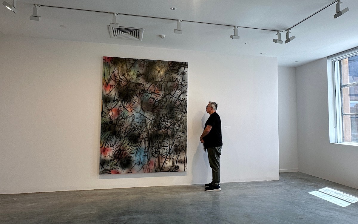
You’re standing at the centre of an expansive art gallery, overwhelmed by what’s in front of you: panel after panel of stupendous works – densely-written labels affixed next to each piece. These labels may offer a window into the artist’s intention, or the social and historical context of the work.
Without any background information, how do you make the most of your visit? Do you turn to the curatorial wisdom in the accompanying text? Or can the art be experienced just as profoundly, if not more so, without any external guidance?
We asked five experts – and their answers suggest art may be witnessed in as many wide and varied ways as it is created.
Why? Jump to:
Chari Larsson
Yes – but on the proviso that the labels are succinct and helpful, which they ideally will be in a reputable museum or gallery.
Well-crafted labels are brief, spontaneous and lively and are worth engaging with. They will frequently start with a description of the object and shift to a broader discussion of the object’s context.
Labels should be able to ‘speak’ to a broad range of audiences: from a casual and curious visitor through to a subject matter expert. Turgid ‘art jargon’ is notoriously difficult to decipher and can negatively impact the visitor’s experience. This is a breach in the museum’s responsibility to its audiences.
Another common notion is that an artwork can stand alone – and no context is necessary. But the idea that art exists outside of ideological and historical frameworks is an outdated concept.
Wall labels are at their strongest when they make complex histories and ideas accessible to a broad range of visitors. Consider, for example, Kamilaroi and Bigambul artist Archie Moore’s award-winning kith and kin at the Venice Biennale.
The installation was both a memorial to Indigenous deaths in custody and a genealogical chart. It visualised Australia’s violent history as well as humanity’s interconnectivity.
This information was communicated concisely in the introductory wall text positioned in the entrance to the Australian Pavilion. For a global audience, this is a crucial starting point for understanding the scope and ambition of Moore’s installation.
So yes, wall labels count. Great labels can create new perspectives and new ways of seeing – and being – in the world.
Cherine Fahd
I’m leaning towards no. Maybe that’s because I’m an artist. You don’t need to understand the work to experience it. Labels that give the basics – the artist’s name, title and year – are obviously useful. But the ‘explainer’, not so much.
How can a short piece of text capture everything that goes into an artwork? The presence of an explanatory label suggests there’s one correct way to see the work. Waiting for revelation, hoping the label will explain, burdens the experience.
If there is a label, wait before reading it. Look longer than you think you need to. No need for certainty or knowing what it means. Just be drawn in. Maybe it will stay with you. Or maybe it won’t. That’s all right too.
Sometimes labels overload the experience. Before you’ve had the chance to look, to feel, you may be given the artist’s gender, sexuality, race and politics, all spelled out, yet often irrelevant to the work. This context may help us understand the artist, but does it help us understand the object in front of us? The best labels don’t close down meaning, but help keep the experience alive beyond words.
Many artists want viewers to bring themselves to the work, to freely interpret and be active participants. The problem is we aren’t taught how to do that with art. We expect meaning to be handed over and the didactic label sets up this expectation.
Perhaps this is an Australian condition, wherein art is often dismissed as impenetrable, or something to grow out of, or something a ‘five-year-old could have made’.
Read: Gallery wall labels: short, long, digital or none at all?
Kit Messham-Muir
The label next to an artwork usually has a few functions, but the main ones are to give you the ‘who’ (artist), ‘what’ (title) and ‘when’ (date). Sometimes there will be additional interpretive information – the ‘why’.
Curators can spend many hours writing the ‘why’. Some explanations are great, some are not. Those aimed at children are usually better. Either way, I’d argue you have all the information you need from the who, what and when. Here’s how.
The artist’s name is important because a screen-printed painting that looks like an Andy Warhol may actually be by the artist Sturtevant, who created copies of many iconic artists, particularly Warhol. Her works raised interesting questions about notions of male artistic genius and how ‘canons of great art’ are constructed. So the person behind the work is important.
Then there’s the title, the biggest clue for how to read an artwork. The 1871 painting we know as Whistler’s Mother is actually titled Arrangement in Grey and Black No 1. James McNeill Whistler titled it this way because he was more concerned about the aesthetic arrangement of paint than he was with a sentimental painting of his mother, who apparently posed when Whistler’s model didn’t turn up to his studio.
The ‘when’ information is also vital. Imagine Jackson Pollock’s Blue Poles (1952) at the National Gallery of Australia being accidentally labelled as (1852). A hundred years earlier, Pollock’s drips would have made no sense. But in 1952 his paintings were part of the cutting-edge free form aesthetic of the day. And if it was labelled 2015, it may seem ironic, or part of the zombie formalism of the mid-2010s.
Naomi Zouwer
As an arts educator with a focus on how children engage with art, I’m going to answer this with children in mind.
Children tend to interpret art differently to adults. For instance, they are less likely to follow a predetermined route and their attention is drawn by visual appeal, rather than narrative or historical sequence. Research comparing eye movement patterns of children and adults in a museum environment has found “children relied much more on bottom-up processing (i.e. their own visual exploration of the artworks)”.
When an artwork does grab a child’s attention, they’ll usually want to know more about it. And my experience shows they’ll likely want to know what it’s about more than other details such as the medium or when it was created (unless it’s really, really old, in which case there’s a ‘wow’ factor).
If there’s a quote from the artist on the label, this can be a useful way for children to unpack the concepts behind a work, either by themselves or with an adult. Sometimes the title also provides clues to the artist’s intentions.
However, it’s not one-size-fits-all. My advice is to ask the child what they want to know and approach it that way. While the label may not answer all their questions, it may help start a different conversation. That’s the great thing about art: it creates opportunities for deeper thinking.
Some galleries feature children’s trails to engage young people beyond labels. These are a great guide for children (and adults) to explore with. The Art Gallery of NSW’s Magritte exhibit, for instance, includes imaginative prompts, questions for inquiry and take-home activities.
Read: 5 tips to alleviate the stress of preparing an exhibition
Sasha Grishin
The case for having labels is relatively simple. An audience has limited information on the exhibition or selection of exhibits, so a curator guides them through wall texts that serve as an introduction to the show.
You’ll usually first see an ‘introductory’ label text, followed by thematic labels and then specific object labels. The problem arises when viewers spend more of their time reading labels than actually looking at the artworks.
The average time an adult visitor spends looking at an art object in a museum may vary, but numerous studies suggest it’s somewhere between 15 and 30 seconds. Most of this time is devoted to reading the label – and then a quick glance to check the object conforms to the label, or to take a selfie. The art itself is somewhat shortchanged.
Strictly speaking, labels aren’t necessary. The fabled Barnes Foundation collection in Philadelphia survived for most of its existence without labels and with a prohibition on photography. Henri Matisse reputedly said: “The Barnes Foundation is the only sane place to see art in America.”
David Walsh’s Museum of Old and New Art (Mona) in Hobart has also largely dispensed with wall labels and scholarly rhetoric. Viewers are encouraged to use an app called The O to digitally access object information, interviews with artists and art historical commentary. Galleries that aren’t blessed with Mona’s resources frequently opt for minimal captions, or access to a QR code to read on your phone.
Personally, I rarely read labels. I’d rather set out to experience the artwork itself. If I am puzzled by something, then I turn to the labels for help.
Noor Gillani, Digital Culture Editor, The Conversation
This article is republished from The Conversation under a Creative Commons licence. Read the original article.