Image via Shutterstock
How do you tell the story of an arts project? Documenting the creativity of its evolution requires flexibility as well as structure. When it comes to designing a website for an arts project or exhibition, this can be a difficult issue to solve. For the designers at Hello Monday, the challenge was doubly hard when faced with the task of designing a site for Future Library, an art project by Katie Paterson located in Norway which will run for one hundred years.
If you haven’t heard of it before, Future Library is (or at least will become) an anthology of books. So far, the project has involved the planting of a forest in Norway and each year Paterson invites an author to contribute a new work of literature.
In 2114, the forest will be logged and the books collected in this anthology will be printed on paper made from the now-matured trees.
The duration of the project meant the team at Hello Monday had to design a site that allowed room to grow. ‘Even though we’ve done several art projects in the past, Future Library is different. Just like the forest in Norway, it will be growing over the next many decades,’ explained Andreas Anderskou, Managing Director of Hello Monday.
‘From a philosophical perspective, it’s interesting to realize that we’ll never experience the completion of the project. There’s a Greek proverb that inspired us to plant a forest in Brazil. The quote says: “A society grows great when old men (and women) plant trees whose shade they know they shall never sit in”. It’s such a crucial lesson. We have to think beyond our own existence.
‘For that reason we tried to create something that can last for a long time. The soundscape is important too. We want to transport users into the forest where birds and wind surround them.’
Anderskou said the key to a great website for an arts project is striking the perfect balance between creativity and usability. This means not overwhelming the art project the site is being created for, but accentuating it.
‘The key to a great website for an arts project is striking the perfect balance between creativity and usability.’
‘We’re telling the story about an art project, but it’s important that users don’t think that the site is a new art piece. It’s all about enhancing, not hijacking the project. If technology is used in a subtle, supportive way, it has the ability to do just that,’ said Anderskou.
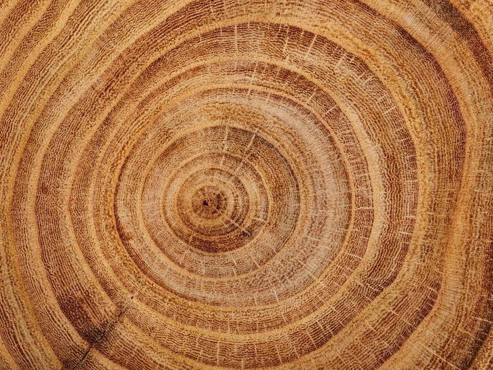
The team started with a strong visual metaphor – the growth rings of a tree – that could expand as the site (and anthology of books) grew. The navigation of the site was built from there.
‘Growth rings are nature’s way of counting the years, so it felt like the right visual metaphor for the navigation. It’s strange to think that we’ve created a site where the content is only 4% done. The remaining content will be added over the next 96 years. So we made sure that the site works well when the remaining content has been added too. In other words, you can jump to the year 2052 for instance, there’s just not any content yet.’
Anderskou’s advice for other designers creating a website for an arts project is to enjoy the creative freedom it brings, ‘but always remember to keep a steady eye on the concept, so you don’t lose yourself, and the project goals, in the process.’


