Everywhere we turn today, we hear about the digital pivot we have been ‘forced’ to embrace during the Coronavirus pandemic.
For many of us, that has been a struggle out of the quicksand, not feeling as tech savvy as we are expected to be in embracing these things with a smile. And let’s face it – now is not the time to throw huge bucks on professional photography with a looming recession.
Be it making the most of your Instagram feed or just making your website look a bit more professional to help push the eCommerce along, we bring you a suite of DIY in-studio photography know-how.
Jump to:
Getting started
When we think of studio photography, it is usually some hip dude dressed in black, rolling around a studio in a kind of choreographed dance and surrounded by loads of super expensive equipment, and eve more assistants.
The bad news for that dude is that it can be much simpler. The kitchen bench, your iPhone, some bulldog clips and a big-ass piece of stiff white paper can suffice, and can also surprise with the results.
Add a window with good natural light, and you are starting to look like a pro. Well almost. In short, you will need:
- Camera, and yes your phone is OK
- Tripod – bendy or stiff
- Sweep – and no it’s not the broom in the back of the cupboard
- Bounce cards, clamps, pegs or bulldog clips
- Stable table
- Window is a fantastic bonus
- And confidence in yourself
Photographer Jeff Delacruz knows that getting your product photos up to par can be intimidating, because professional photography is expensive, and we usually equate that with ‘good’.
His advice for someone starting out is to embrace the Window Light Technique – a studio set up adapted for those on a budget. ‘The perceived value of your products is directly impacted by the quality of your product photography. [This technique] is designed to be simple while producing excellent, high-quality results for most product types,’ says Delacruz.
Natural light versus artificial light
The key to Delacruz’s Window Light Technique is as you would think – natural light. The bigger the window the better. You can also set up in a garage with the door open, which will have the same effect. But the key to this method is to avoid direct sunlight hitting your set, as it is too harsh on the object.
Delacruz explains simply: ‘Being closer to the window will create a softer light with darker, softer shadows. Being farther away will give a more even light, but with lighter, sharper shadows.’
Set up your shooting area so that your table is 90 degrees to the window, and turn off all other lights in the room. This is the most common mistake made. You can also place your set up at 45 degree angle to the window, or straight on, effectively manually managing the rake of your light.
Food photography is often shot with a window behind the setup and the camera shooting into the window for a more dramatic photo. This might work well for objects.
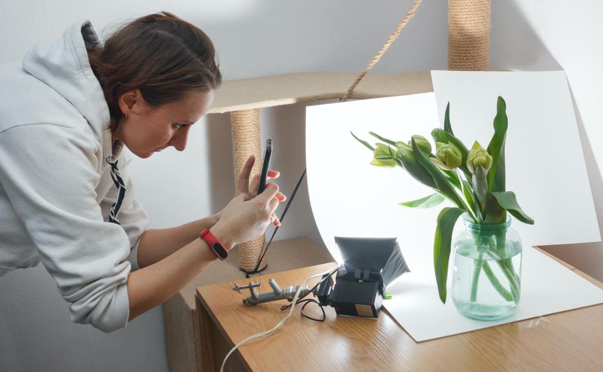
If you need more light on a specific area, use a piece of white poster board or foam board to reflect more natural light into that area. This is where those laundry pegs, clamps and bull dog clips come in handy.
In contrast, artificial light – also referred to as ‘hard light’ – produces a more focused light surface, but it is also more complex, and often requires a multi-light set up … which is more equipment (equals more money).
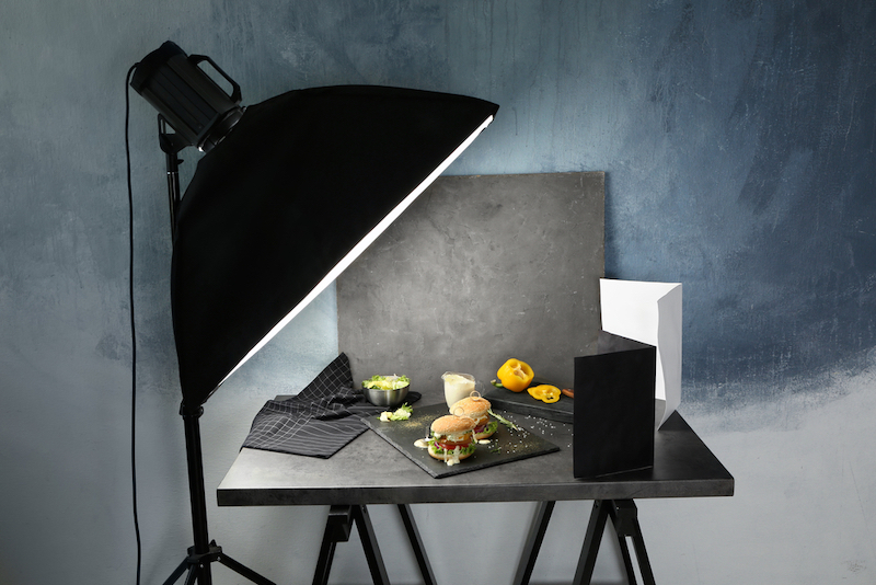
Image Shutterstock.
A further option is to use a light tent. That is those fancy square diffused light thingy on a stand bought from photography suppliers. The quality of light is very even and often shadowless.
But using artificial light will also mean that you need to have a solid understanding of how to balance the exposure of the different lights using f/stops and shutter speeds on your camera. Then you have the issue of colour balancing your lights, what is called colour temperature.
Another option is Rim Lighting, which is where you set up a suite of lights around the rim of your set. The trick here is making sure you counter correct the shadows of each light you add. However, this method is good if you are wanting to photograph an object with a lot of detail.
Whether you use natural light or artificial light, you’ll need to always be aware of the shadows. Sometimes you want them for effect, but mostly it is about making them disappear. You can do this by adding a ‘fill light’ – that is a less intense, directional light source to supplement your main light. It should come from the opposite direction of your main light source.These can be anything from simple desk lamps to tradies lamps bought at the local hardware store.
Hint: You are looking to see that it floods out the shadows that the object creates.
Warning: The cost of a light tent and professional lights can add up, possibly costing more than hiring a professional (and freight to their studio), so you have to weigh up volume versus cost. If you are producing a lot of objects for production and sale, then this might be a good investment.
But for artists are faced with shooting large wall-based artworks, you need to run the figures.
Flexible versus traditional tripod
‘A picture might be worth a thousand words, but when it comes to product photography, photos can be worth thousands of dollars,’ says photographer Rohan Arora.
‘The point is, eCommerce is a massive industry, and it keeps growing. This represents a great deal of opportunity, but also lots of competition. So, how do you stand out? Crisp, professional product photographs not only highlight the benefits of your products, but they also inspire trust in your ability to deliver a quality product,’ Arora continued.
That means getting a tripod – you can’t wing it.
To get a clear, in-focus shot you need stability. A tripod will also help you in framing your object – to test it – and then use that set up repeatedly.
If you are shooting with your smartphone, you can get an inexpensive tripod for under $25. Many of these come in mount options with flexible legs, which you can bend to achieve the camera angle you want. They are super cheap, but will only effective when shooting in close proximity.
For a DSLR camera, there are many lightweight expandable tripods you can use, and it can double for on location shoots when you’re on the road, or on a residency or travelling.
And if the budget is totally blown, even a stack of books will work. The key is no hand-held, half-baked efforts.
Hint: If you are shooting multiple shots, then tape where the footprint of your tripod sits to ensure every shot is registered in same spot.
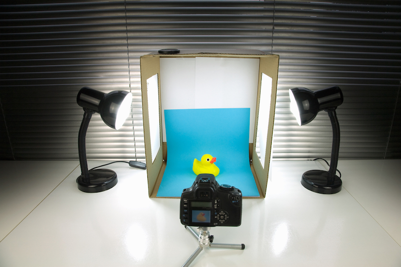
Image Shutterstock.
Sweep vs lightbox
The backdrop on your studio image is crucial to passing it off as ‘professionally’ photographed. The quick give away is the line created between the studio floor and wall, or your table and background. This is where a sweep comes in handy – a simple, stiff sheet of paper (poster board) that creates an arc in the space (from the table to the wall), to diffuse the spatial definition and blemishes around the object, and thereby focussing the eye where you want it: on your art.
What is magic here, is that the sweep’s curve becomes invisible. And, it can be created in any colour. And if you need more light, well then whack a couple of desk lamps angled into the lightbox to bounce the light around the object.
Hint: Always be aware of counter correcting shadows.
A sweep is also the recommended technique for photographing wall-based artworks, and objects if they are too large, or if you don’t have a lightbox. For walls, however, you are going to have to invest in a solid roll and rig it up, but the investment is worth it. And remember – pack it away carefully. One dint and your sweep is ruined.
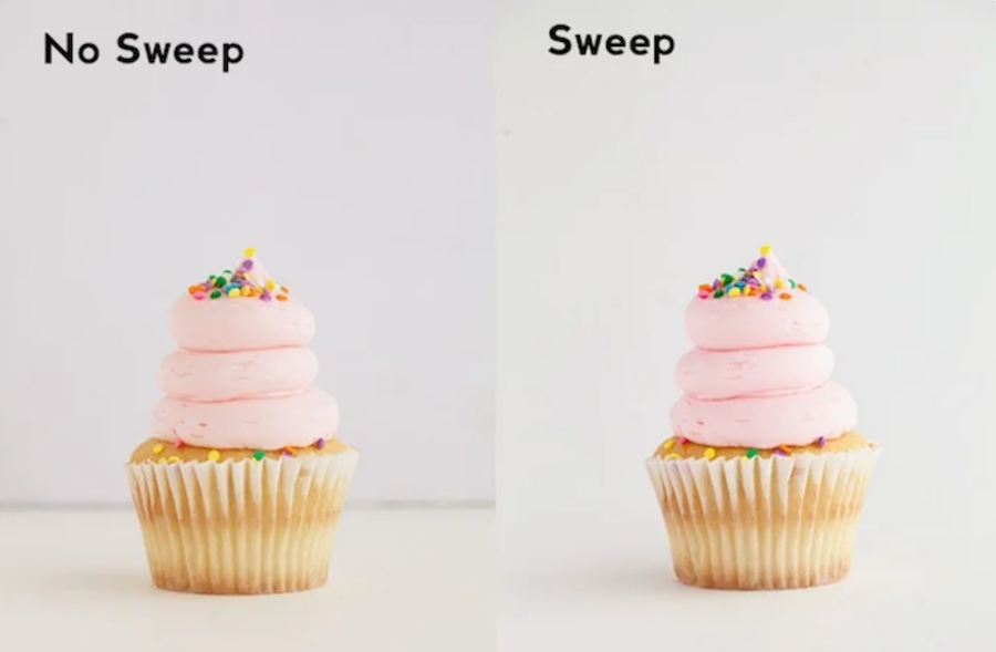
Here’s a side-by-side comparison showing why a sweep matters. Photo Taylor Mathis.
The second option is a custom lightbox. These can be purchased pretty cheap online these days, as little as $40, which is much easier than trying to make one yourself.
The joy of these is that they usually collapse and can be stored away. The downside, is that they are often small in scale. Often, the higher end lightbox on the market will have lighting already rigged up within them. The simple advice is buy one – they are cheap, they work, and they take up no space.
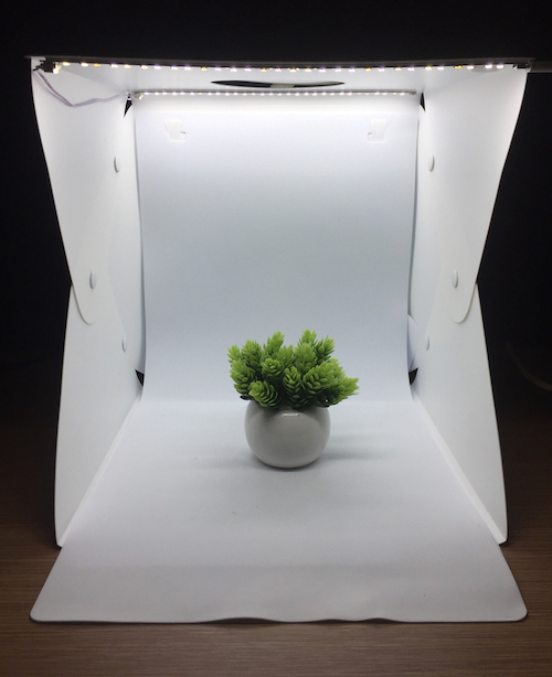
Image shutterstock
Studio vs real-world
Sometimes, images of your work may be advantaged by real-world backgrounds rather than the clinical framing of lightbox imagery. This is particularly so for the craft and design sector.
When shooting in this manner, use portrait mode on your camera which will give your product depth. This setting blurs the background so the context of the product is clear but not competing against the product itself.
It’s Ok to touch up
The last step to getting high-quality product photos is to use editing software to touch up your photographs. Hey, even professional photographers do it! It is not about a band-aid on a shoddy pic, rather it allows you to correct the blemishes that the human eye does not pick up. A good example is straightening up a shot. You might also find that cropping intensify the image. Just don’t go overboard and pump up the contrast to steroid proportions.
The most popular programs are Adobe Photoshop Elements and Adobe Photoshop CC.
And the last piece of advice – take LOTS of images. Regardless how confident you are you got the shot, take another selection from varying angles. Too many times DIY photographers have made the mistake to pack up, download … and then swear, because the image is not sharp when blown up on the computer or the crop is not spaced correctly.
And like a good bottle of wine, it get better with time. Don’t get disheartened by your early results. This is not only a new skill, but an investment in your career and studio business.
