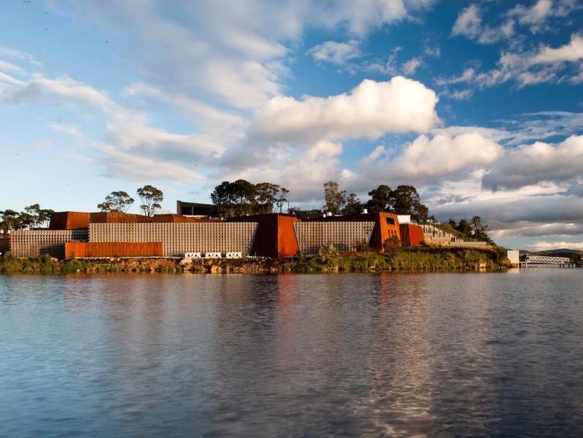
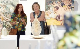
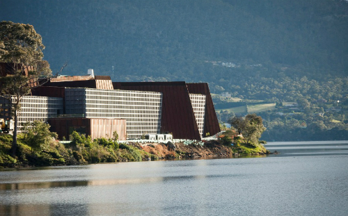
MONA opened in January 2011, the design of firm Fender Katsalidis
If we have not visited them, we have certainly heard the hype surrounding these two Australian art museums – Brisbane’s Gallery of Modern Art (GoMA) and the Museum of Old and New Art (MONA) in Hobart. Both sit on the hip of a watercourse; both integrate the latest in museum technologies; both have had record attendance and are recognised internationally. The two, however, couldn’t be more different.
Now that they have settled into their skins – GoMA celebrated its fifth anniversary late last year and MONA’s new building turns three in January – it’s time enough to bring in the jury!
At a recent in.site symposium presented at CoFA (University of New South Wales), GoMA and MONA’s architects, curators and exhibition designers tag-teamed, stamping a case for the building success – or not – as a complete capsule from brief to build to visitor experience.
Which one came out on top?
ArtsHub puts the discussion on the table as it was presented for you to decide.
The Brief:
Their could be no greater antithesis between the briefs for these two buildings, one a public institution driven by an international competition and funded by government, the other the organic and eclectic personal journey of a collector.
Architect Lindsay Clare of Clare Design presented the case for GOMA: ‘Our brief from Arts QLD was quiet extensive, about 170 pages, which took many years to write but one person nominated by Arts QLD to represent the views of the brief’, and further locked down by government contracts for the build.
Clare added, ‘In all its facets the art gallery is a public building; the significance of public consciousness is characterised in the fact that it returns enclosed space to the public, to the city.’
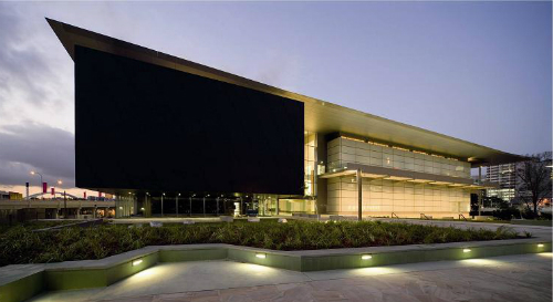
He said, ‘The character of the architecture responds to the spirit of the term Queensland vernacular and to the spirit of contemporary art.’
Nicole Durling, Senior Curator at MONA said of its position, ‘The brief consisted of nine pages of twelve point front – quite different to GOMA’s 170 – considering some of the ideas we were trying to capture.’
She continued, ‘(David Walsh) couldn’t really give anything concrete. He said, “you’re smart you tell me. You read between the lines of what I am saying”. We had no idea how this space would work, who would come, how they would respond.’
James Pearce of Fender Katsalidis, the firm responsible for MONA’s design and build said that started building without a known end or brief for contractors. He said, ‘It turns out not knowing where you are going is a positive. MONA is an expression of David Walsh’s self discovery and the best thing about it is that it invites all of us to go on that journey.’
The Site:
Integral to any building is how it sits within, and relates to, a site. In the wake of Frank Gehry’s Guggenheim Bilboa, the museum as a destination has increasing shaped how public spaces are being designed.
Clare said of GoMA’s site, ‘The opportunity to entice the cultural life of Brisbane was provided through the creation of an open generous and democratic urban pavilion. The start of this was both a logical and intuitive response to the curve of the river that was in dialogue with the city and stands at the threshold of the cultural precinct.’
Pearce described the eccentricities of MONA’s site: ‘The first thought of David’s was that it should be underground…Constrained by water at one level and a ground floor plaza at the top.’
‘The plaza was really the landscape reclaiming that box (of the gallery). The plaza extended out in fingers over to allow people to get out to the edge, as is the want, to overlook the water with the remainder of it being a vegetated roof.’
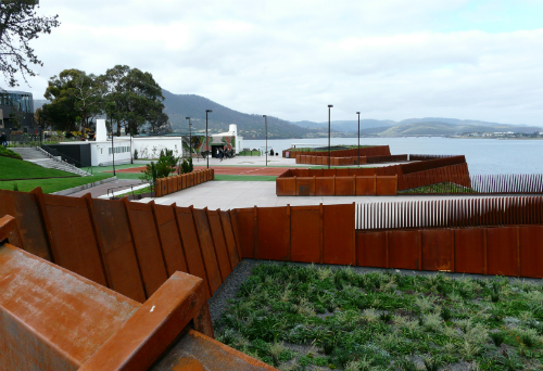
He added of Walsh, ‘Architecture he believes is a science not an art. He wanted architects to problem solve and he wanted to be part of that solution. So as architects how can we encourage this idea of self-discovery? First, it was about the journey – the location chosen by David is hard to get to, so the fact that you have chose to go there you have already engaged.’
In contrast GoMA sits at the heart of Brisbane’s cultural precinct. Clare said, ‘South bank overall is linear and parallel river. In contrast the new gallery was placed perpendicular to the river, therefore totally reconfiguring the urban environment.’
‘This gesture strongly defines the public place and active social spaces are created around the edges of the building such as terraces, verandahs, balconies, outdoor rooms, restaurants all under a sheltering roof, a gesture which responds to Queensland weather…that open outwards into the surrounding space and framing city beyond.’
Entry & Navigation:
This is where the two differ most, and some would argue that it is MONA’s downfall.
Visitors have to deliberately journey to MONA catching a ferry, climbing stairs, arrive at a tennis court and then descend into a somewhat cavernous space, at times dark and narrow, at others open and lofty. Mystery and discovery sit at its heart.
GoMA in contrast opens blatantly to the widest audiences, with welcoming cafes and verandahs on its peripheral edges. Visitors arrive at a central cruciform, allowing for maximum personal navigation, light and open and didactic.
Clare said, ‘The entry experience of concrete triggers memories of something informal, casual everyday and perhaps domestic. In summary, navigation is easy and the spaces are non-imposing. The architecture is concerned with issues of light and lightness, connection and optimism.’
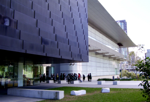
Clare added, ‘Navigation without prescribing routes is key.’
Peace said MONA entry was, ‘a journey to take you out of the everyday and clear your mind and perk your curiosity’. He continued, ‘The structure is exposed as is the rockwall, which has the added advantage of the external building reflecting itself internally.’
‘Perhaps the most direct response to the architecture was David Walsh’s attitude, an irreverent attitude but one also studious and deeply interested in the human condition. It is the sort of attitude that displays the animals of the meat we are eating at one of the MONA parties. David is a vegetarian. It is an attitude that puts a bar in a gallery and one that puts a (Anselm) Kiefer – the most significant piece in the gallery – at the far end of the gallery without any directions to get there, or even knowledge that it might exist.’
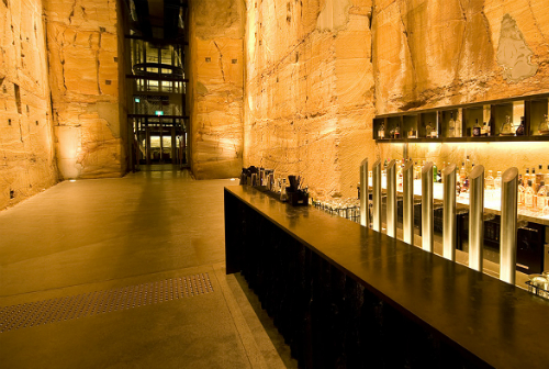
Durling said, ‘It is a part of MONA’s success and the way the people interact with the space. There is a personality there and you may not be able to put your finger on it, but it permeates.’
Working with it:
The two museums move between soaring triple height zones to intimate galleries and black box spaces. Flexibility is the mantra of good museum design in our times. Durling agreed: ‘We are a collection based museum but I try to think of the space more of a Kunsthalle where all the spaces are up for grabs.’
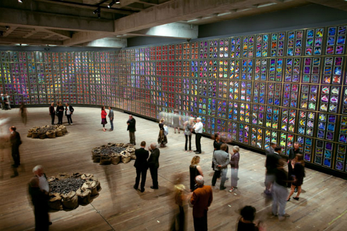
Suhanya Raffel, former Acting Director and Head of Asian and Pacific Art at QAGOMA, explained that one of the most exciting aspects of being a curator is to be engaged with how artists work with the building skin. She added, ‘They will test it every time.’
She said, ‘The first encounter in the building had to be art and the building was available to where they wanted to work.’
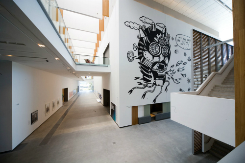
Durling agreed, ‘As a curator I see myself as a problem solver and respond to the environment and artworks you are given, and to just constantly work through what is put in front of you.’
‘We did not aim at MONA for a neutral space. We wanted the whole experience to be about the space, the objects, the feelings. (Walsh) wanted to create a cacophony to provoke this human sensory (response) where multiple things can be processed. It was meant to be relentless – physically and mentally.’
Pearce explained, ‘Within the gallery the light is dark and moody; there are no directions given and no obvious routes to take. Exploration is required. The art is not labeled you have a device “the o” that provides information only if you ask for it.’
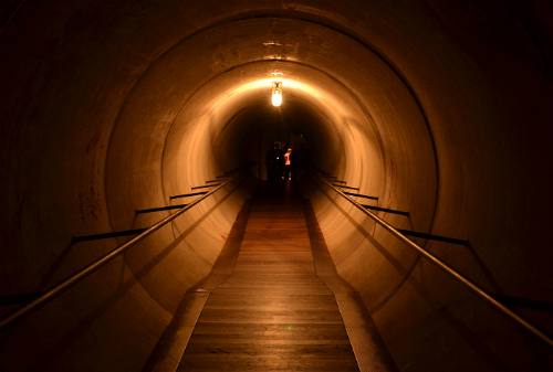
Durling added, ‘We use lighting and sound, and smells, to create paths to weave you around; slashes of brightly lit small works in darkened spaces, then beyond a brighter space at the back drawing you through.’
In contrast Raffel explained GoMA’s character: ‘It is interesting to think of the Asia Pacific Triennial as a project defining an art museum rather than a collection. It informed the kind of character that we had began to understand GOMA to be. It comes from what we were doing at QAG a decade before that; it was an attitude that informed who we were.’
The result?
Clare sumarised, ‘We have 15 different gallery spaces that we created each with their own character and function, differing in the use of light, scale and material, but similar in that they are open, inviting, clear and uncomplicated spaces that allow for a range of installations and events to occur.’
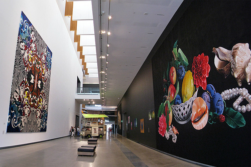
Clare said, ‘The saving grace for us was there was a clause in our contract with Arts QLD that said we must maintain contact with gallery staff throughout the project…we were instructed many times not to talk to the gallery…and we just kept pulling out that clause.’ He added, ‘It was only that clause that allowed us to get a reasonable result.’
Pearce continued, ‘The aim was not to directly create a beautiful building or a popular museum as these things are removed from creating functional space, but allowing for chance and encouraging self discovery.’
‘MONA enjoys working it out in public. The punters also appreciate a space that is made out of simple robust materials that says how it is, and shows how its made – architecture as problem solving and not as art.’
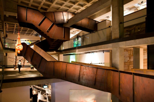
‘If we consider the gallery is never actually a finished space and then we are getting closer to that ideal that it is always a work in process and embrace that it will keep on evolving and changing so we shouldn’t fuss too much with it.’
He added, ‘This raised a really interesting question – can we design a museum to be future proof?’
And from a curatorial perspective During sumarised: ‘The collection is not static in space and time we choreograph as a sequence of events that produce multiple narratives. It is not about making shows or turning around exhibitions. We are not answering a serious of questions. It is about actions and responding to outcomes.’
During concluded that it ultimately was about, ‘not holding on too tightly to the result you are trying to achieve but just going with the time.’
How to you weigh it up? Visit them, and visit them often as they morph and mature, manage and manipulate their spaces into the future.
